HTML & CSS
Due on Tue, 01/28 @ 11:59PM. 15 Points.
Preview
This is the first of a 2-part exercise that is intended to help you to understand how HTML, CSS, and JavaScript work together to produce a web app. To do this, we will be reverse engineering the Spotify website. Each of the following assignments will build on the previous one:
- HW4: HTML & CSS using Flexbox and CSS Grid (due 1/28)
- HW5: Using JavaScript to interact with the DOM (due 2/25)
Some Background Concepts
Please begin by downloading the assignment files:
Part 1: Understanding the Layout
As mentioned in class, one of the biggest challenges in front-end web development is marshaling CSS and HTML to produce the kinds of layouts you envision in your head. Lab 2 was an effort to scaffold this learning process (solutions now posted).
To understand one approach to reproducing the Spotify layout, we have made an HTML and CSS file inside the “layout” directory. Together, index.html and layout.css produce the two layouts pictured below (for desktop and mobile).

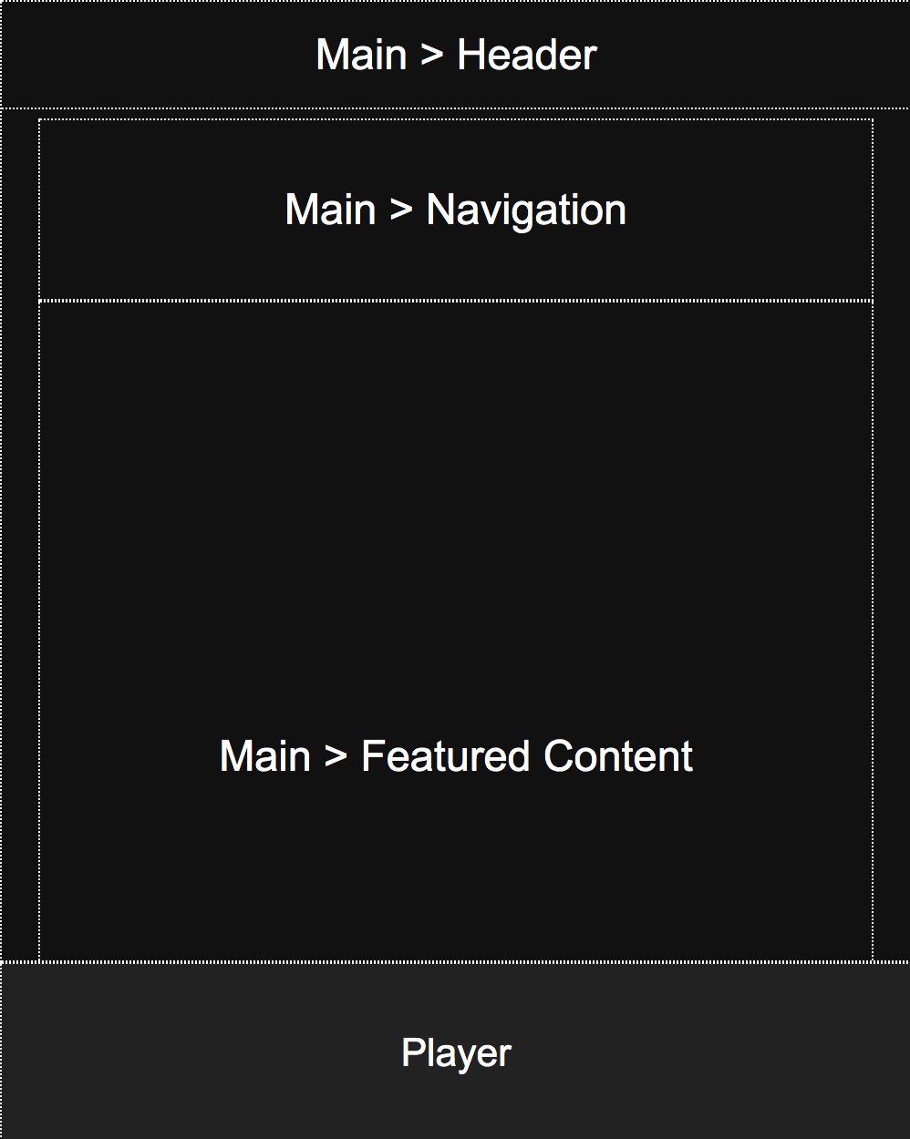
Desktop Layout
The main desktop layout is controlled by the CSS grid defined in the body selector. Each region of the page is then assigned to an area using the grid-area property. Note, there are other ways to accomplish this same effect. This is one approach.
body {
    display: grid;
    overflow: hidden;
    margin: 0px;
    grid-template-columns: 250px auto;
    grid-template-rows: auto 100px;
    grid-template-areas:
       "left main"
       "bottom bottom";
    height: 100vh;
}
Mobile Layout
The mobile layout is achieved by overriding some of the CSS properties within a media query. In this case, the grid is redefined as a single-column layout, the left panel gets hidden, and the position of the header is reconfigured:
@media screen and (max-width: 700px) {
    body {
        grid-template-columns: auto;
        grid-template-areas:
           "main"
           "bottom";
        height: 100vh;
    }
    header {
        left: 0px;
        width: 100vw;
    }
    aside {
        display: none;
    }
}
Practice
Please open layout/index.html and layout/layout.css and study them. The techniques used in these files will form the basis of your Spotify app.
Part #2: Understanding Flexbox
Display and Positioning
All of the child containers have a display of “flex.” This means that they behave according to the rules of flexbox. Flexbox makes it easier to create flexible responsive layout structures (though of course, it depends on what you’re already familiar with). Whereas CSS Grid is useful when you have a finite number of boxes to arrange, flexbox is useful when you have an unknown number of items, images, videos, cards, etc. that you need to “gracefully” arrange into a space. Some key properties to pay attention to:
display: flex;
flex-direction: column | row;                      /* column stacks vertically, row arranges horizontally */
justify-items: center | flex-start | flex-end;     /* horizontal positioning */
align-items: center | flex-start | flex-end;       /* vertical positioning */
flex-wrap: wrap | nowrap                           /* whether things wrap or get squashed */
Note also that the header element has been assigned position: fixed;. This means that the header will be anchored to the top.
Update: Flexbox Tutorial
Updated Saturday, 1/25 @2PM
Because Flexbox is a bit convoluted, I’ve made a tutorial to try and walk you through the process of using flexbox to make responsive cards. I have also uploaded this code in the homework 4 zip file. You can also preview it on GitHub.
Assignment Instructions
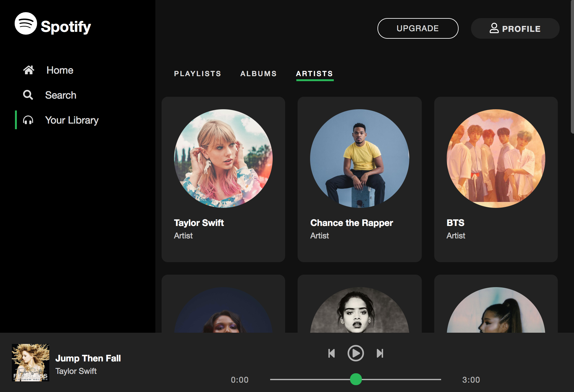
In this assignment, you will create the Desktop UI pictured below (click to make the image bigger) by modifying the files in the your_task folder (which you have downloaded). Please read the instructions carefully and complete the 5 steps below.

Step #1: Left Navigation
Complete the following tasks:
In the index.html file, add Font Awesome icons (Spotify logo, home, search, and headphones) within the “aside” tag (pictured below) in accordance with the screenshot. Note that the Font Awesome font reference is already included at the bottom of your index.html file. Your job is to search for relevant icons and include them. For instance, to get the Spotify icon, take a look here.
Other than adding the icons, please do not make any other changes to the HTML.
<aside id="sidebar">
    <h1>
        <!--TODO: Font Awesome Icon Here -->
        Spotify
    </h1>
    <a href="#">
        <!--TODO: Font Awesome Icon Here -->
        Home
    </a>
    <a href="#">
        <!--TODO: Font Awesome Icon Here -->
        Search
    </a>
    <a class="selected" href="#">
        <!--TODO: Font Awesome Icon Here -->
        Your Library
    </a>
</aside>
In the 03_left_nav.css file, update the CSS to make the UI look like the screenshots (pictured above). This should be accomplished primarily by using flexbox properties and the box model. Be sure to put all of the CSS related to the left navigation in 03_left_nav.css.
Step #2: Header & Nav Styling
Next, you need to style the header and nav sections:
<header>
    <a href="#" id="upgrade">Upgrade</a>
    <a href="#" id="profile">
        <i class="far fa-user"></i> Profile</a>
</header>
<nav>
    <a href="#">Playlists</a>
    <a href="#">Albums</a>
    <a class="selected" href="#">Artists</a>
</nav>
In the 04_header_nav.css file, add CSS style blocks to make the UI look like the screenshots (pictured above). Just as with Step #1, all alignment should be done using the box model (e.g. padding, margin, height, width) and with flexbox (e.g. flex-direction, justify-content, align-items). Be sure to put all of the CSS related to the header and nav tags in the 04_header_nav.css file.
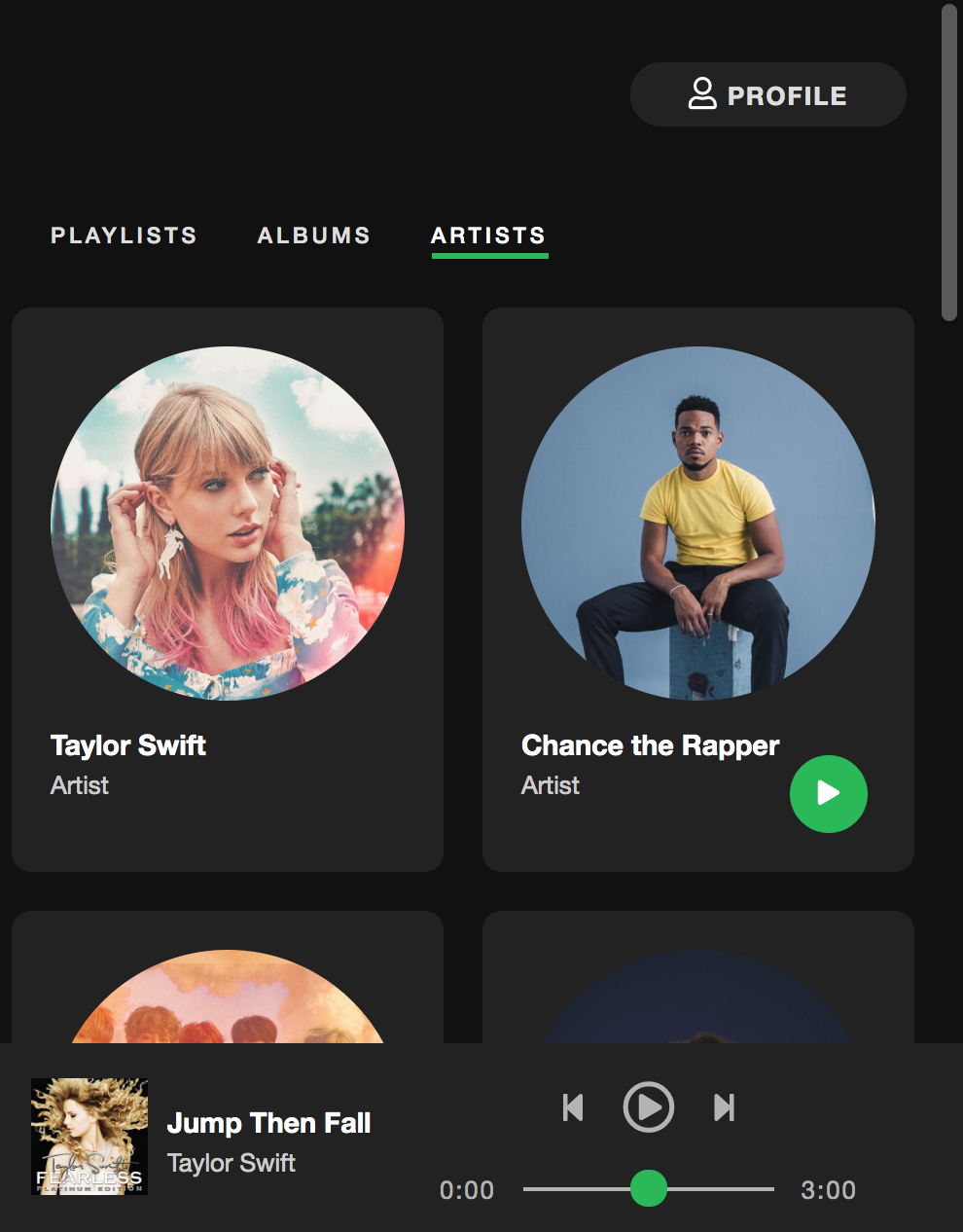
Step #3: Artists Panel
Next, you need to style the section cards that represent each Spotify artist (pictured below):
<article id="featured-content">
    <section class="artist-card">
        <div>
            <img src="https://i.scdn.co/image/62b33d12e2b9a033cf77585f6e3d4b2c6b3a63a1" />
            <h3>Taylor Swift</h3>
            <p>Artist</p>
            <span class="play-button"><i class="fas fa-play"></i></span>
        </div>
    </section>
    ...
</article>
In the 05_artists.css file, add CSS style blocks to make the UI look like the screenshots (pictured above). Again, all alignment should be done using the box model (e.g. padding, margin, height, width) and with flexbox (e.g. flex-direction, justify-content, align-items). Be sure to put all of the CSS related to the artists in the 05_artists.css file.
Step #4: Create Responsive UIs
Create the following responsive UIs shown below. If you’re using more than 10-15 lines of code to achieve each of these effects, you’re on the wrong track. Add the CSS to make these responsive UIs to 02_layout.css.
Tablet: Use Flexbox to display albums 3-across.
Mobile: Use Flexbox to display albums 2-across and hide the left menu.
Step #5: Hover Effects
Finally, implement the 4 hover effects shown in this video.
Rubric
- Left Navigation:
- Icons added (2 pts)
- Styling reflects screenshot (2 pts)
- Header & Nav Styling (2 pts)
- Artists Panel (3 pts)
- Responsive UIs Implemented (3 pts)
- Hover effects implemented (3 pts)
What to Turn In
Turn in a zip file of the your_task files with your completed HTML and CSS files.