Schedule > Visual Design Part 1
Today we will be discussing some principles of good composition and visual design (which will continue into next week).
Activity: Using CSS to Create Good Composition
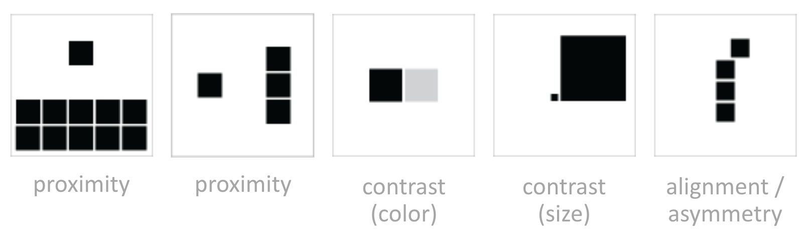
You’re going try to use some CSS to create an image gallery with good composition. Remember some of the principles we’ve just gone over (in the Williams article):
- Proximity
- Alignment
- Repetition
- Contrast
These principles can be mixed and matched in many ways, and instantiated using size, color, margins, padding, fonts, and so forth.
Your Task
- Open the following Codepen. You can either fork it and register for CodePen to save it, or download the files and edit them using a code editor.
- Select a header and a body copy font from Google Fonts. Here is some sample code of how this is done.
- Instantiate the principles of proximity and alignment to create nice photo cards that flow. Consider using flexbox (see this sample).
- Modify the HTML / CSS so that there is one featured photo. Use the principle of contrast to make it stand out.
- When you’re done, paste a link to your file (ideally on CodePen) in this Google Doc so that we can take a look at different techniques. You will continue working on this next week, so make sure you keep track of your files.
Tips
- Use whitespace liberally
- Play around with different font weights (and choose a font that supports many weights).
- Try not to use any borders. Let the whitespace shape the sections.
- For now, don’t use color. We’ll do that next week!
CSS Review
Text Properties
Just a reminder of a few useful text properties for creating nice, readable web pages. Also a note on units:
- em: units are relative to the font size of the current element (2em means 2 times the size of the current font)
- rem: units are relative to the font size of the root element
- For custom fonts, use Google Fonts. Once you’ve selected one, scroll down to see suggested parings.
.body-copy
    font-family: "Times New Roman", Times, serif;
    font-style: italic;
    font-weight: bold;
    color: #999;            // font color
    text-align: left;       // left is default
    letter-spacing: 1.5em;  // space between letters
    line-height: 120%;      // space between lines
    word-spacing: 5px;      // Space between words (usually default is good)
    font-size: 1.1em;       // for responsive design, use em units
}
The Box Model
Just a reminder of a few useful text properties for creating nice, readable web pages. Also a note on units:
- em: units are relative to the font size of the current element (2em means 2 times the size of the current font)
- rem: units are relative to the font size of the root element
.page-section {
    box-sizing: border-box;     // "border-box" does not count padding / border in size calculations
    border: dotted 1px #CCC;
    padding: 10px;              // note: also padding-right, padding-left, padding-top, padding-bottom
    margin: 10px;               // note: also margin-right, margin-left, margin-top, margin-bottom
    width: 50vh;                // vh stands for viewport height, vw stands for viewport width
}
Flexbox
Flexbox is useful when you have a series of elements that you want to position in a way that flows (flexibly grows and shrinks according to the number of elements and according to the size of the container). To do this, there is typically:
- A parent container that is assigned a
displayproperty offlexand aflex-wrapproperty ofwrap - A set of child elements where the sizing properties are set.
- See this sample for guidance.
Readings
- Williams, Robin (2015). The Non-Designer's Design Book, Chapter 1.
- Williams, Robin (2015). The Non-Designer's Design Book, Chapter 2.